Safer Foundation Annual Reports
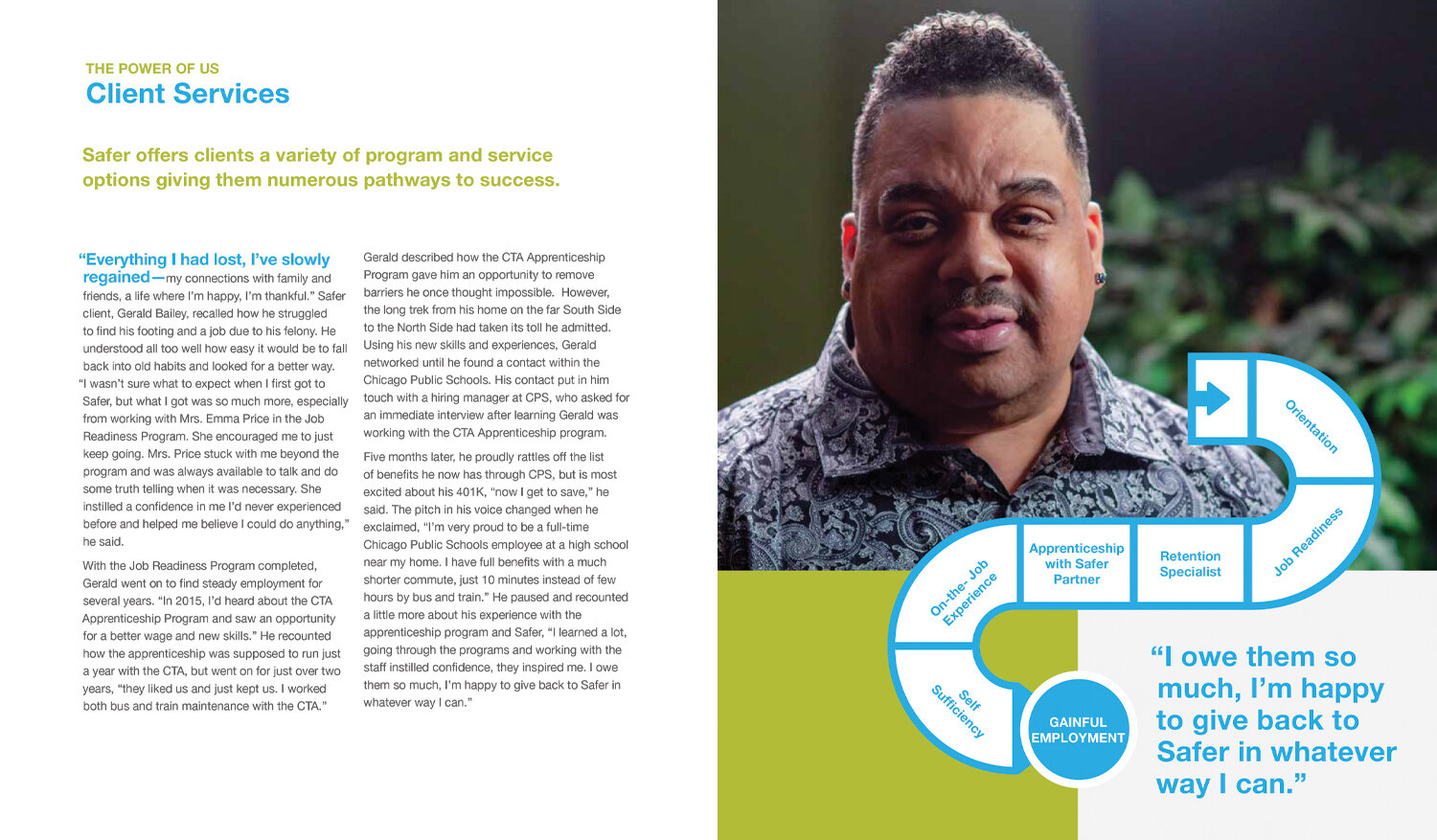
When we began our five-year collaboration with Safer, they had not produced an annual report in many years. We developed a visual language based on their existing branding. Working with what had already been in use, we gave them a cohesive look and feel that could be easily reproduced on other materials. Custom photography and a bright, clean interpretation of their color palette give their communication materials a unique and uplifting identity. We strengthened their messaging by developing simple and powerful themes for each annual report. These themes could be used throughout the year to give focus to their outreach and fundraising.


